Build Your Career in Responsive Web Design
Our program started in 2022 with eight students and a simple goal: teach people how to create websites that actually work across all devices. Since then, 47 graduates have moved into junior and mid-level positions at agencies and studios across Europe.
Schedule a Program ChatTwo Learning Paths Available
We keep things straightforward. Pick the track that fits your schedule and background. Both cover the same material—just structured differently.
Intensive Development Program
This is for people who can dedicate their days to learning. Morning lectures, afternoon lab work, and regular portfolio reviews. Starts September 2025.
Evening Development Program
Built for people juggling jobs or other commitments. Same curriculum, spread over evenings and weekends. Kicks off October 2025.
Learn from Felix Brenner
Lead Instructor & Program DirectorI've been building responsive sites since 2014, back when we were still figuring out how to handle retina displays properly. Worked at three different agencies before starting this program. My approach is pretty hands-on—lots of code reviews, real debugging sessions, and honest feedback about what works in actual production environments.
What You'll Actually Learn
Foundation Skills (Months 1-3)
HTML semantics, CSS fundamentals, and mobile-first thinking. We start with basic layouts and progressively add complexity. By month three, you're building multi-page sites that adapt to different screen sizes without breaking.
Responsive Techniques (Months 4-6)
Flexbox, CSS Grid, and media queries—the tools you'll use every single day. We work through real layout challenges: navigation menus that collapse properly, image galleries that reflow, forms that don't frustrate mobile users. This is where things click for most students.
Performance and Optimization (Months 7-9)
Fast sites aren't optional anymore. You'll learn image optimization, lazy loading, CSS efficiency, and how to test across actual devices. We cover the metrics that matter and how to improve them without guessing.
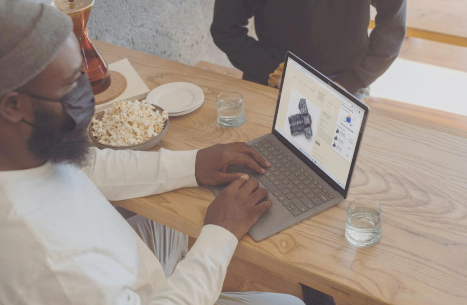
Client Projects (Months 10-12)
Real work for real clients. Small businesses and nonprofits who need responsive sites built properly. You handle requirements, design implementation, testing, and delivery. This is your portfolio material and your first taste of professional deadlines.
What Previous Students Say
We asked graduates from our 2024 cohorts to share their honest experiences. Here's what came back.

I came from graphic design with zero coding background. The program moved fast but Felix made sure nobody got left behind. Three months after finishing, I landed my first developer role. Still reference my course notes weekly.

The client projects were nerve-wracking but incredibly valuable. You learn how to handle feedback, meet deadlines, and debug under pressure. I've built on those four projects to get eight freelance contracts since graduating in March.